Adobe Illustrator for data visualisation
I have recently been exposed to a different, a bit more artistic approach when it comes to data visualisation. Rather than focusing on producing strictly academic and rather ugly graphs using Python, R, Stata or Matlab (or basically any other academically acclaimed software), Federica Fragapane’s course on data visualisation showed me how to produce more aesthetically pleasing visualisations.
Throughout the course she explains the importance of data visualisation, its role and potential. We can hear about her influences and her sources of inspiration. Using her projects as visual aids, Federica contextualises the delicate relationship between information design and its audience. Finally, she explains how important the collaboration is when encountering information about unfamiliar topics.
Personally, I have always been inspired by BBC and The Economist when it comes to the data visualisation. Some of the graphs I have used for the essay competition clearly exhibit this influence. When I first saw some of Federica Fragapane’s projects I instantly thought of that full page infographics that I saw in multiple journals, e.g. “Managers in football matter much less than most fans think.”. I could not wrap my mind around how to create these multi-layered, more detail oriented infographics using only classical tools like R. The answer is easy - while a good knowledge R allows for some really detailed and beautiful visualisations, one can always try to push them to the next level using other tools.
Below I will shortly discuss how one can go from cleaning and wrangling data using statistical tools to the state of the art visualisation using combination of both R and Illustrator.
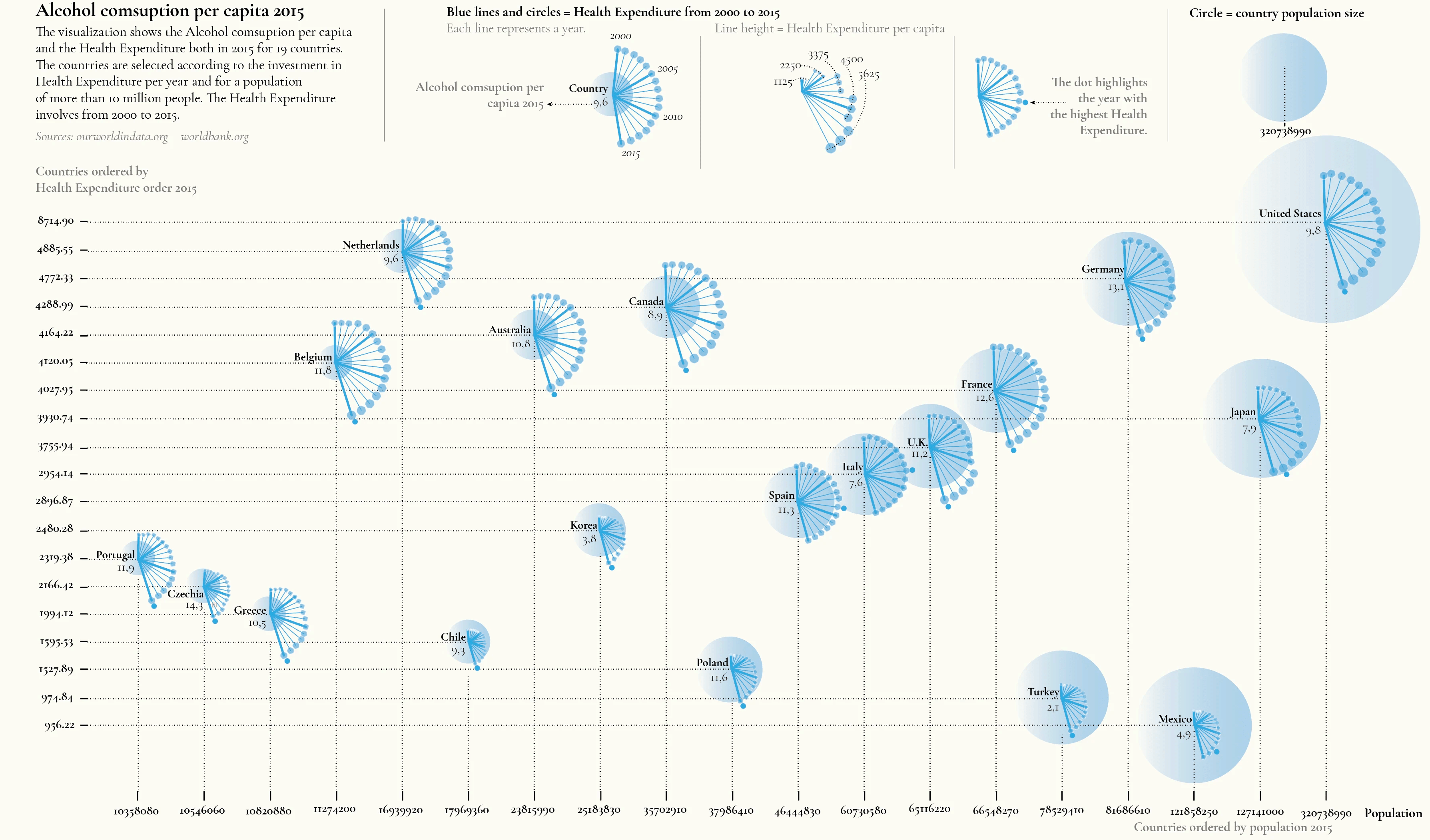
I have decided to visualise the alcohol consumption and health expenditure in 2015 for 19 countries. The countries were chosen based on their health expenditure and population of more than 10 million people. I also wished to visualise how the health expenditure changed over time (based on data from 2000 to 2015). Data is publicly available here1.
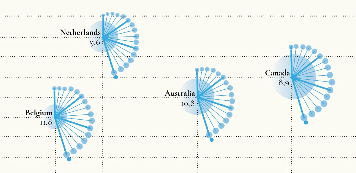
After cleaning and further wrangling data I had to think how to visualise multiple layers of information on one graph. Using the nature influence I have come up with a dandelion clocks to show the change in health expenditure per capita over 15 years. Each line represents a different year while the length of the line shows the health expenditure per capita. The size of the blue circle represents the country population size. In addition, countries were ordered by the health expenditure in 2015 on the y-axis and by population in 2015 on the x-axis. Finally, the number below the country’s name represents the alcohol consumption per capita in 2015. The result was as seen below.

Some closer look on the legend.

And on the nodes of four countries, Belgium, Netherlands, Australia and Canada.

I am really happy with the result. Looking forward to the next project when I will be able to use the Illustrator! Check out the portfolio of Federica for more inspiration when it comes to the data visualisation.
-
Based on: ourworldindata.com and worldbank.org. ↩