I found a significant result in pure noise
What happens when you go looking for a result in a dataset that has none? Eighteen slices produce a nine-point lift at p = 0.011, and the analyst turns out to be the variable nobody controls for.

An experiment with nothing in it
I generated 2,400 customers. Each one got a region, a device, a plan, a tenure band and an acquisition channel. Each one was randomly assigned to receive a new onboarding email or not. Then each one either stayed for ninety days or did not.
That last part is the important bit, so I will be precise about it. Retention was drawn from a coin weighted at 42%, and that coin knew nothing. It did not know which arm the customer was in. It did not know their region, their device, or anything else. Every customer had exactly the same chance of staying.
There is no effect in this dataset. There cannot be. I wrote the generator.
So the correct answer to “does the email work?” is no, and any analysis that concludes otherwise is wrong. That makes it a useful place to watch how a wrong conclusion actually gets made — not through fraud or incompetence, but through a sequence of individually reasonable decisions.
The honest test
Randomisation gave 1,187 customers in control and 1,213 in treatment. Retention came out at 41.4% against 41.4%.
The difference is +0.02 percentage points, with p = 0.992.
This is the correct result. There is no effect, and the test says there is no effect. If the analysis stopped here, the post would be over and the email would be quietly shelved.
Nobody stops here.
Then somebody says “but”
Not out of malice. Out of curiosity, which is supposed to be the good one.
“An overall null could be masking something. Maybe it works for mobile users, or for people on annual plans, or in a particular region. Averages hide things — you taught us that.”
They are not wrong about averages. So you cut the data. Four regions, two devices, two plan types, three tenure bands, three acquisition channels, plus the obvious device-by-plan combinations. Eighteen slices. Each one a perfectly sensible question that somebody in the business would genuinely like answered.
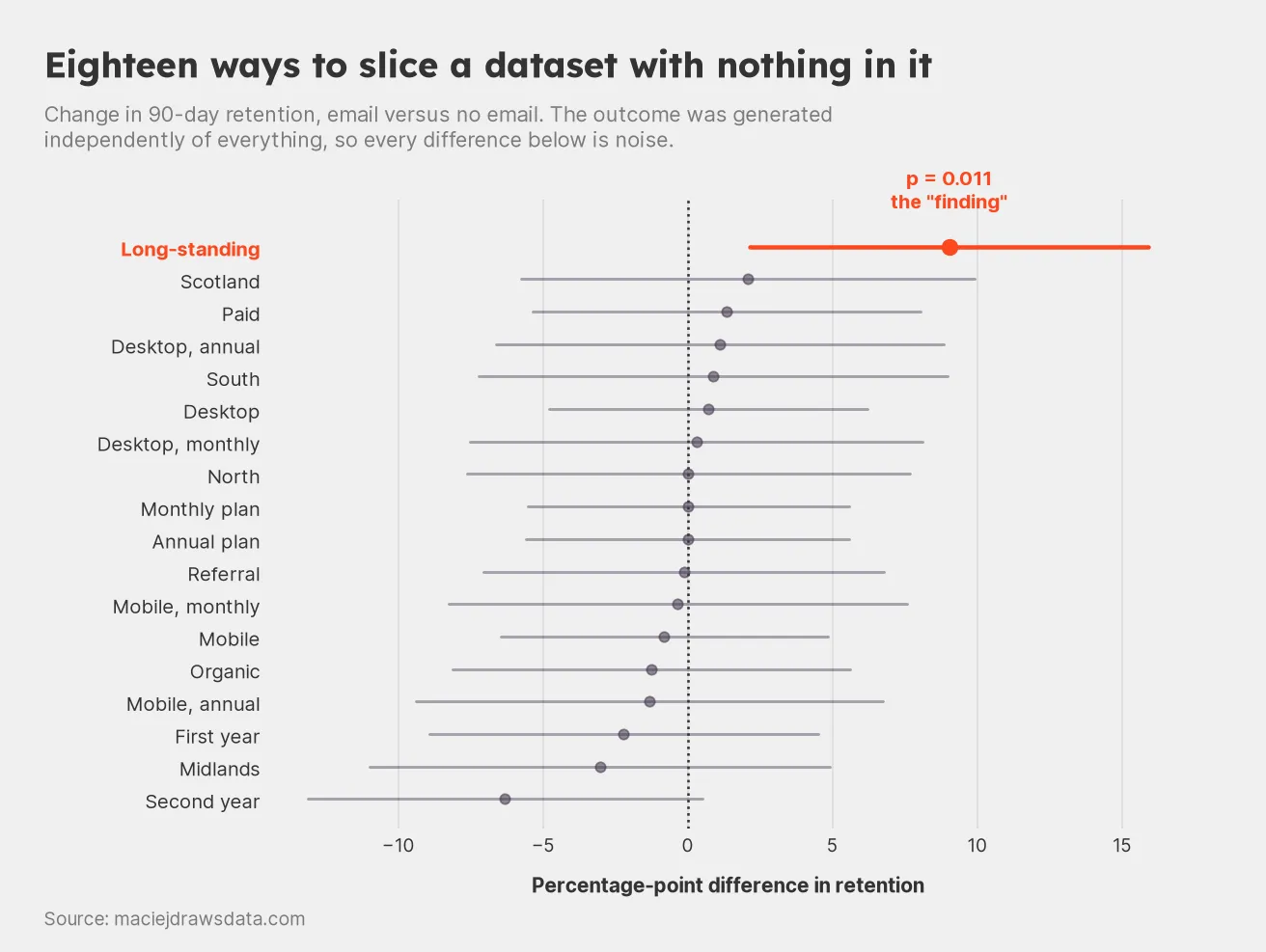
Eighteen questions, one of which got an interesting answer.
Seventeen of them come back boring, scattered around zero exactly as they should.
The eighteenth does not. Among long-standing customers, retention was 35.8% without the email and 44.8% with it. That is +9.0 percentage points, on 369 and 404 customers respectively, at p = 0.011.
The slide that writes itself
Here is the thing that makes this dangerous rather than merely wrong: the finding is good. Not statistically — commercially. It has everything.
It has a healthy sample. Nearly 800 customers, not a dozen.
It has a large effect. Nine points of retention is not a rounding error, it is a number that changes a business case.
It has a plausible mechanism, and this is the part that should frighten you, because the mechanism arrives entirely unbidden. Of course it works better on long-standing customers. They have more history with the product, so they have more to come back for. The email reminds them what they already value. New customers do not have that context yet, which is why it does nothing for them.
I made that up just now, in about four seconds, about a dataset I personally generated from a fixed coin. It is a completely satisfying explanation for a thing that did not happen. Give a human a number and a free afternoon and they will produce a mechanism for it — that is not a flaw in analysts, it is what brains do.
And it has a p-value under 0.05, which is the part everyone checks and nobody interrogates.
What p = 0.011 actually said
A p-value answers one narrow question: if nothing were going on, how often would I see a result at least this extreme?
For the long-standing slice, the answer is about one time in ninety. Rare. Suspicious. Worth acting on.
Except that framing quietly assumes something that was not true here: that this was the only question asked. It was not the only question. It was the eighteenth.
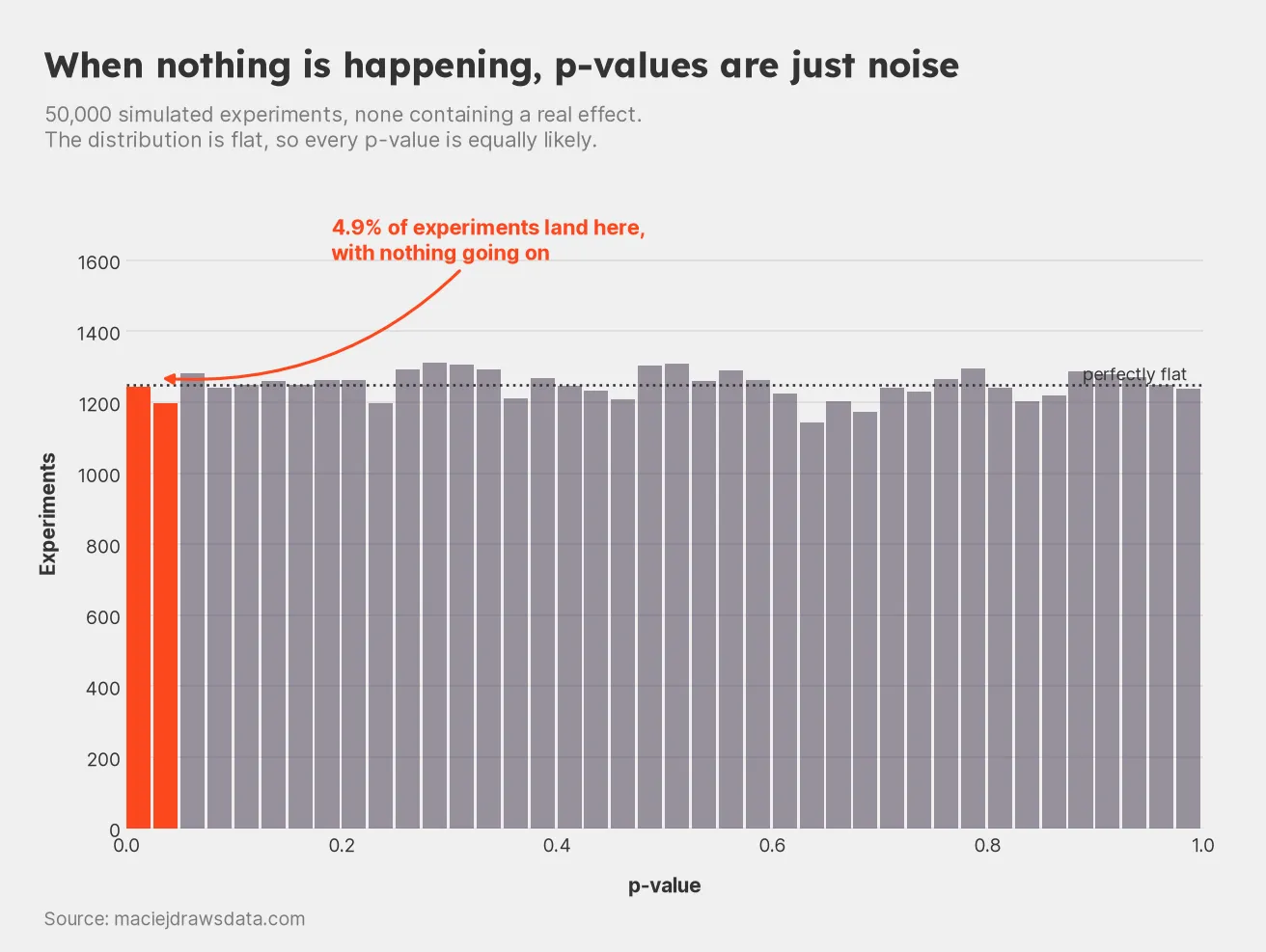
50,000 experiments with no effect in any of them. The p-values are spread perfectly evenly.
Run 50,000 experiments where nothing is happening and the p-values come out uniform. Every value equally likely. A p-value of 0.03 is exactly as common as one of 0.83 when there is nothing to find.
In my simulation, 4.88% landed below 0.05. That is not a failure of the method. That is the method working precisely as specified: 0.05 is the false positive rate you agreed to accept, per test.
Per test. That is the whole post, really.
Eighteen tests is not one test
If each test has a 5% chance of a false positive, the chance that at least one of them fires is:
With eighteen independent tests at α = 0.05, that comes to 60.3%.
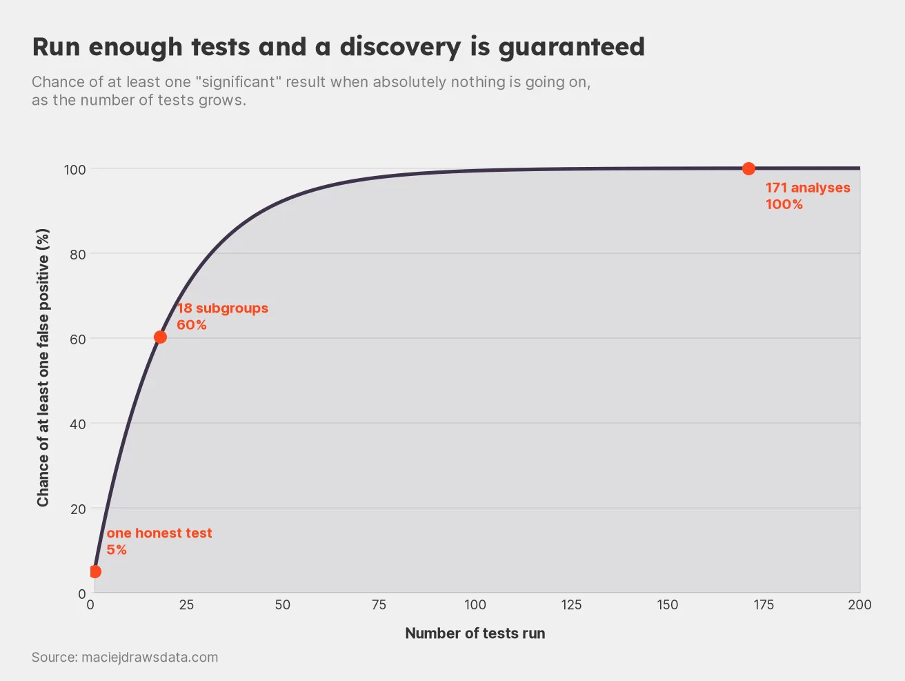
The chance of finding “something” when there is nothing, as the questions pile up.
So finding a significant subgroup was not unlucky. It was the most likely outcome. I was more likely to find a fake result than not, before I had written a single line of analysis.
The standard correction is Bonferroni — divide your threshold by the number of tests:
Equivalently, multiply the p-value. My finding at p = 0.011 across eighteen tests becomes an adjusted p = 0.19, which is nowhere near significant, and which is the correct answer.
The garden is much bigger than eighteen
Eighteen is a flattering count, because it only includes the slices. Real analysis has more knobs than that, and every one of them multiplies.
You could measure retention at 30, 60 or 90 days — all defensible. You could keep every customer, or drop the top 5% of spenders as outliers, or drop the bottom 5% as inactive — all defensible. Combine those with the nineteen ways of cutting the data and you have 171 analyses, none of which required a single dishonest thought.
I ran all 171 on the same empty dataset. Four came back significant, the best at p = 0.006.
Two honest notes on that number. The naive formula puts the chance of at least one false positive at 99.98%, and it did indeed find several. But four is fewer than the nine you would expect from 5% of 171, because these tests are nowhere near independent — they reuse the same customers over and over, so the hits arrive in correlated clumps rather than sprinkled evenly. The formula is an idealisation. The direction of the argument survives it comfortably.
The deeper problem is that nobody actually runs 171 analyses. They run three or four, guided by what looked promising in the first one. The other 167 exist as branches that were never taken but would have been, had the early results pointed elsewhere. That is what Gelman and Loken named the garden of forking paths: you do not need to run every test to be affected by the fact that you could have.
Your correction factor is not the number of tests you ran. It is the number you would have been willing to run.
The test that settles it
There is one move that cuts through all of this, and it is cheap.
Take the finding to data it has never seen. I generated 2,400 fresh customers from the identical process and tested the identical slice — long-standing customers, retention at ninety days, no other changes.
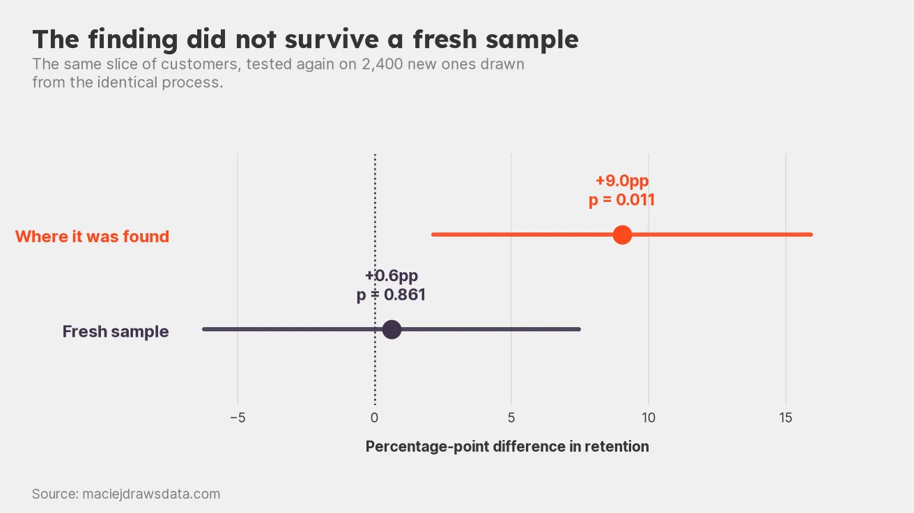
Nine points, then nothing. The mechanism I invented did not make the trip.
42.1% against 42.7%. A difference of +0.6 percentage points, at p = 0.861.
The nine-point lift is gone. It was never anywhere — it was a property of that particular sample, discovered by a search that was guaranteed to find something, and dressed in a mechanism I invented after the fact.
What to do instead
None of this requires more statistics. It requires a small amount of bookkeeping and a slightly uncomfortable amount of honesty.
Say what you are testing before you look. A one-line note naming the metric and the population, written in advance, converts a fishing expedition back into an experiment. It costs nothing and it is the single highest-leverage habit here.
Hold data back. Split the sample, hunt in one half, confirm in the other. It is the only step above that would have caught my finding cold, and it needs no correction formulas or arguments about independence.
Report the denominator. “Retention rose 9 points among long-standing customers” and “we tested eighteen subgroups and this was the only one that moved” describe the same afternoon. Only one of them lets the reader judge it. Say how many things you tried, including the ones you tried and abandoned.
Correct when you are genuinely exploring. Bonferroni is blunt but honest. Benjamini–Hochberg is gentler when you have many tests and expect some real effects. Either beats nothing.
Treat a subgroup finding as a hypothesis, never a conclusion. It has earned the right to be tested properly. It has not earned a slide.
The variable nobody controls for
The uncomfortable part of this exercise is that I did not cheat at any point. I did not touch the data. I did not drop inconvenient rows or run the test twice and keep the better one. Every individual step was defensible, and several were actively good practice — checking whether an average was masking variation is a sensible instinct.
The false positive did not come from any single decision. It came from the sequence, which no single decision-maker was tracking.
Which is why this generalises well past A/B tests. A dashboard with two hundred metrics on it, reviewed weekly, is running ten thousand implicit significance tests a year, and something on it will always be up or down enough to demand an explanation. A quarterly review that hunts for the segment that moved is doing subgroup analysis without the word. Any process that searches a wide space and reports only the winner has this problem, whether or not a p-value is ever printed.
The statistics have been settled for a century. What is not automatic is writing down how many places you looked. The model has no way of knowing, and the number on the slide will not tell you.
Reproducing this
Every figure in this post comes out of one seeded script, which regenerates the dataset, reruns all 171 analyses and redraws all four charts:
data/008-significant-noise/significant_noise.pyOne disclosure, in keeping with the theme. The seed is not arbitrary. Starting from a date and stepping upward, seed 20250449 is the 32nd one I tried, and the first where all three things happened at once: the honest test came back clearly null, a subgroup crossed p < 0.05 by a margin worth putting on a slide, and the finding then died in the holdout.
I searched thirty-two seeds for a convincing false positive, and I am reporting only the one that worked.
Which is, of course, precisely the thing this post is about. It seemed only fair to mention it.